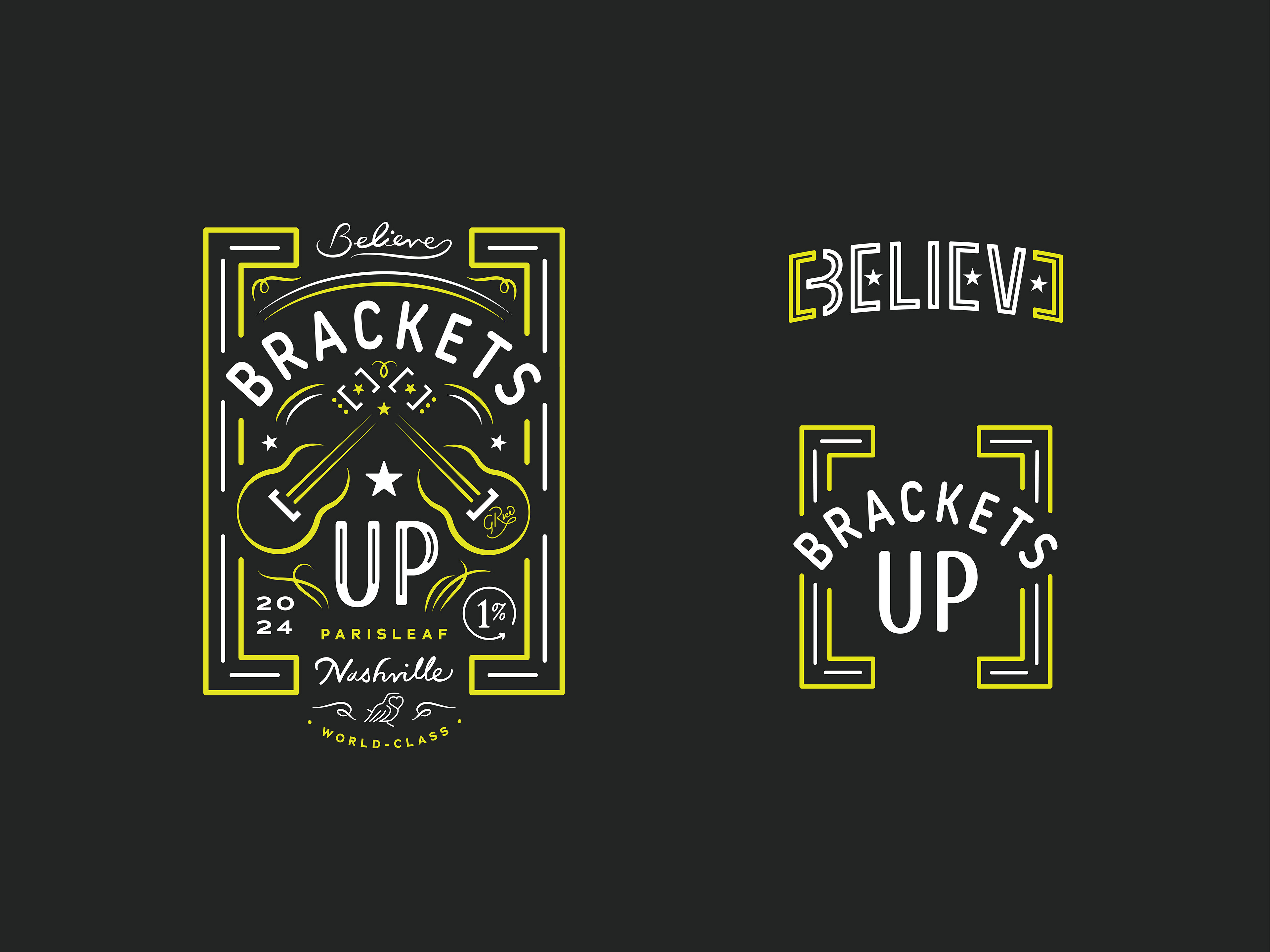
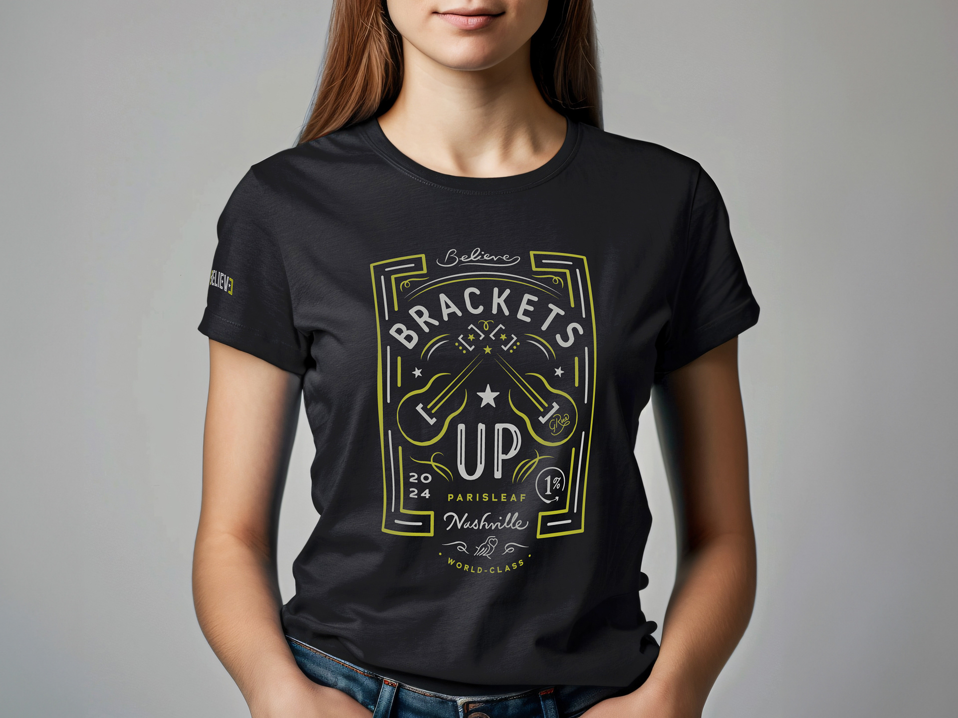
My first design project for Parisleaf was to make a graphic for our 2024 team retreat in Nashville. This was used for shirts, caps, and art prints to commemorate the trip.
Parisleaf’s logomark consists of two brackets, so “Brackets up!” has become our rally cry. The graphic draws inspiration from classic Nashville iconography: two guitars represent the music city (and symbolize collaboration), and the overall aesthetic is taken from neon signs and Tennessee whiskey. Three stars are symbols of the Tennessee state flag.
Nestled within the graphic are quite a few easter eggs and inside-jokes. “Believe” is our theme for 2024. The autograph on the guitar reads “G. Rice” - an acronym for our core values (Gratitude, Responsibility, Integrity, Candor, Empathy). “1%” is a reference to Kaizen (a Japanese philosophy of continuous incremental improvement).
The graphic needed to be able to be embroidered onto a cap as well, so an alternate, simpler version was used for that. A secondary graphic of “Believe” and three stars within the brackets is also printed on the right sleeve of the shirt.


Original concept sketches:
Typefaces:
Custom hand lettering, Noway Round, Adrianna Extended Bold
Custom hand lettering, Noway Round, Adrianna Extended Bold
